
Turn your dreams for a better world into real and measurable change
Join our community of world-changers and get access to my free resources that show you how to apply data, behavior change and game design techniques to your cause for the epic win.
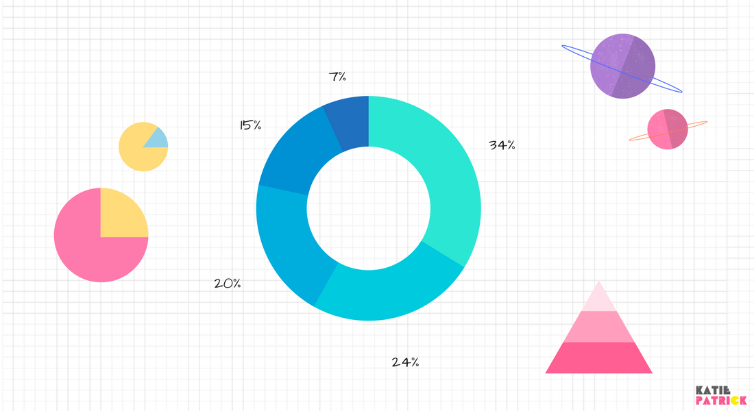
How to design and infographic that works
There's been a trend over the last few years of making big and increadibly complex infographics.
But . . . why?
The test of a good infographic is that it serves a practical purpose. Using the "two lenses" approach problems solving, we can ensure that the sucess of our infographic is define by 1) It creates a measurable change and 2) It catalyzes a behavior change in the reader.
Each infographic needs to tell one central story. It does not need to tell hundreds of stories jumpled together like a spagetti monster.
You wanna know a secret? Instead of making an infographic labryth, you can actually make several individual infographics that each tell a single story.
The "infographic works" test:
1. Can the person understand the central message in 3 seconds?
2. Can the person remember the single main data point you are trying to convey?
3. Is the person moved to change their behavior after seeing your infographic?
If you create multiple infographics, you can use the Hero's Journey template to design a simple narrative structure to present your information in a way that motivates and inspires. You can make a simple slideshow or Facebook video that follows these intuitive steps.
It might go something like this:
1. Ordinary world - what things are like now
2. Call to adventure - what things could be like
3. Refusal of the call - answer initial objections
4. Meet the mentor - present the organisation's expertise
5. Cross the threshold - Invite them on the journey with you
6. The big idea - present you big idea, and what they should do about it
7. Present data that back ups up your big idea
8. Present some more data that backs up your big idea
9. Present more in data that backs up your big idea
10. Acknoldge and losses, winners and losers
11. Deeper meaning of what it's all about
12. Utopian ending, remind of the behavior
Learn more about using data to motivate people in my webinar "How to Save the World with Gamification" and if you want to full course here.

Find this kind of thing interesting? Join our community of world-changers and get access to my free resources that show you how to apply data, behavior change and game design techniques to your cause for the epic win.
Join 
Author: Katie Patrick
Katie Patrick is an environmental engineer and a designer. She helps sustainability professionals, entrepreneaurs and civic innovators to apply powerful techniques in data science, game design and behavioral psychology so they can make epic wins in environmental and social change. She lives in San Francisco with her little daughter Anastasia.
Download free things
Let me help you get really good at changing the world.

Effective Action Checklist

The Gamified Earth Matrix
Looking for ideas? Download this matrix of gamification features and environmental data indicators for new insights into how to wrap gamification in to your project.
Download >>
Download >>

Top 3 Biggest Mistakes
Important!
Don't fall into the traps that many NGOs, start ups, and cities have made before you. Make sure you avoid these all-too-common mistakes
Download >>
Don't fall into the traps that many NGOs, start ups, and cities have made before you. Make sure you avoid these all-too-common mistakes
Download >>
Sign up for news and updates
I occasionally send out updates on projects I've been working on, interesting research, new startups. and events etc.
Your email will never be shared, sold, abused or sent annoying things that are not totally awesome.
Your email will never be shared, sold, abused or sent annoying things that are not totally awesome.